React-WIP-UI - I got tired of saying “Coming Soon” in 10 different ways
A small React package I built after repeatedly hacking together ways to mark unfinished features in my UI.
This started with something really small.
I was building a project, and like always, not everything was ready. Some features were half done. Some were just placeholders. Some existed only because I knew I would build them later.
But they were already in the UI.
And that's where the problem started.
The annoying part no one talks about
Every time I had an unfinished feature, I handled it differently.
Sometimes I disabled a button. Sometimes I added a small “Coming Soon” text. Sometimes I just left it there hoping no one would click it.
There was no system.
Just random decisions depending on my mood that day.
And after a while, it started looking messy. Not visually messy, but conceptually messy.
Users don't know what's broken, what's coming, and what's intentional.
The moment it clicked
At some point I realized this is not a one-time issue.
This happens in literally every project.
There is always a phase where:
- features exist but are not usable
- UI is ahead of logic
- you want to show something without enabling it
And I was rewriting the same patterns again and again.
That's when I decided to stop hacking it and actually build something reusable.
So I made a small library
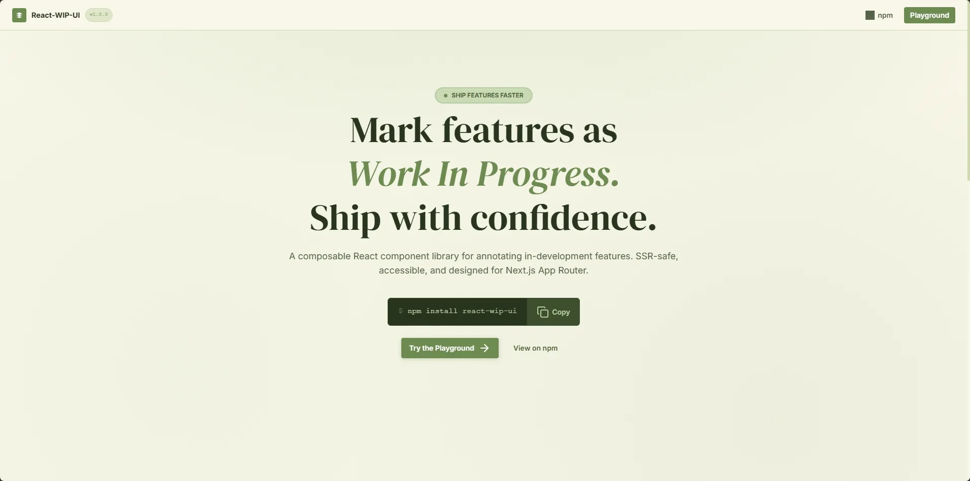
That's how react-wip-ui started.
Nothing fancy. Just a set of components that answer a simple question:
How do you show that something exists, but is not ready yet?
What it actually does
Instead of writing custom logic every time, you get a few building blocks.
Things like:
- corner ribbons
- inline badges
- overlays that blur content
- wrappers that block interaction
- simple banners
So instead of doing this manually:
“disable button + add text + prevent click + maybe show tooltip”
You just do:
<WIP.Block message="Not ready yet">
  <PaymentButton />
</WIP.Block>
Or:
<WIP.Overlay message="Coming Soon">
  <Dashboard />
</WIP.Overlay>
That's it.
The real goal
It's not about saving a few lines of code.
It's about consistency.
Every unfinished feature in your app should feel intentional, not accidental.
Same style. Same behavior. Same message.
Once I started using it, my UI felt a lot more “honest”.
Built with real usage in mind
I built it the way I actually use React:
- TypeScript
- Simple composition
- No heavy dependencies
Also made sure it works properly with Next.js, including SSR. No weird hydration issues or client-only hacks.
Because if it breaks in real apps, it's useless.
You can check it out here
I also added a small playground
While working on this, I realized something.
Trying UI components by reading code is slow. You install it, set it up, tweak props… just to see what it looks like.
So I added a simple playground.
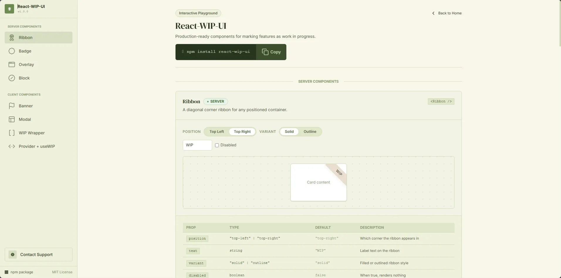
It lets you mix and match different WIP components and instantly see how they behave. No setup, no friction.
If you just want to explore the library and get a feel for it, this is the fastest way.
What I'm thinking next
Right now it solves the basic problem well.
I don't want to overcomplicate it though.
The whole point is to keep it simple.
Final thought
Every app has unfinished parts.
We just don't treat them like they deserve proper UX.
This is a small attempt to fix that.
Nothing revolutionary. Just something I wish I had earlier.